
- Digital health
- One-page website
- Next.js
- Patients · clinicians · researchers
DiaRehab website case study: a one-page Next.js site for a diabetes rehabilitation programme
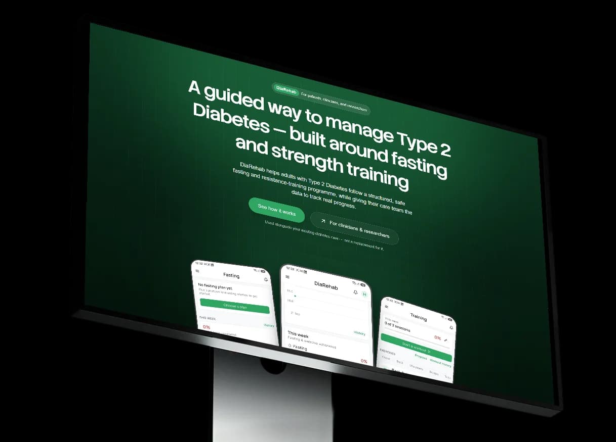
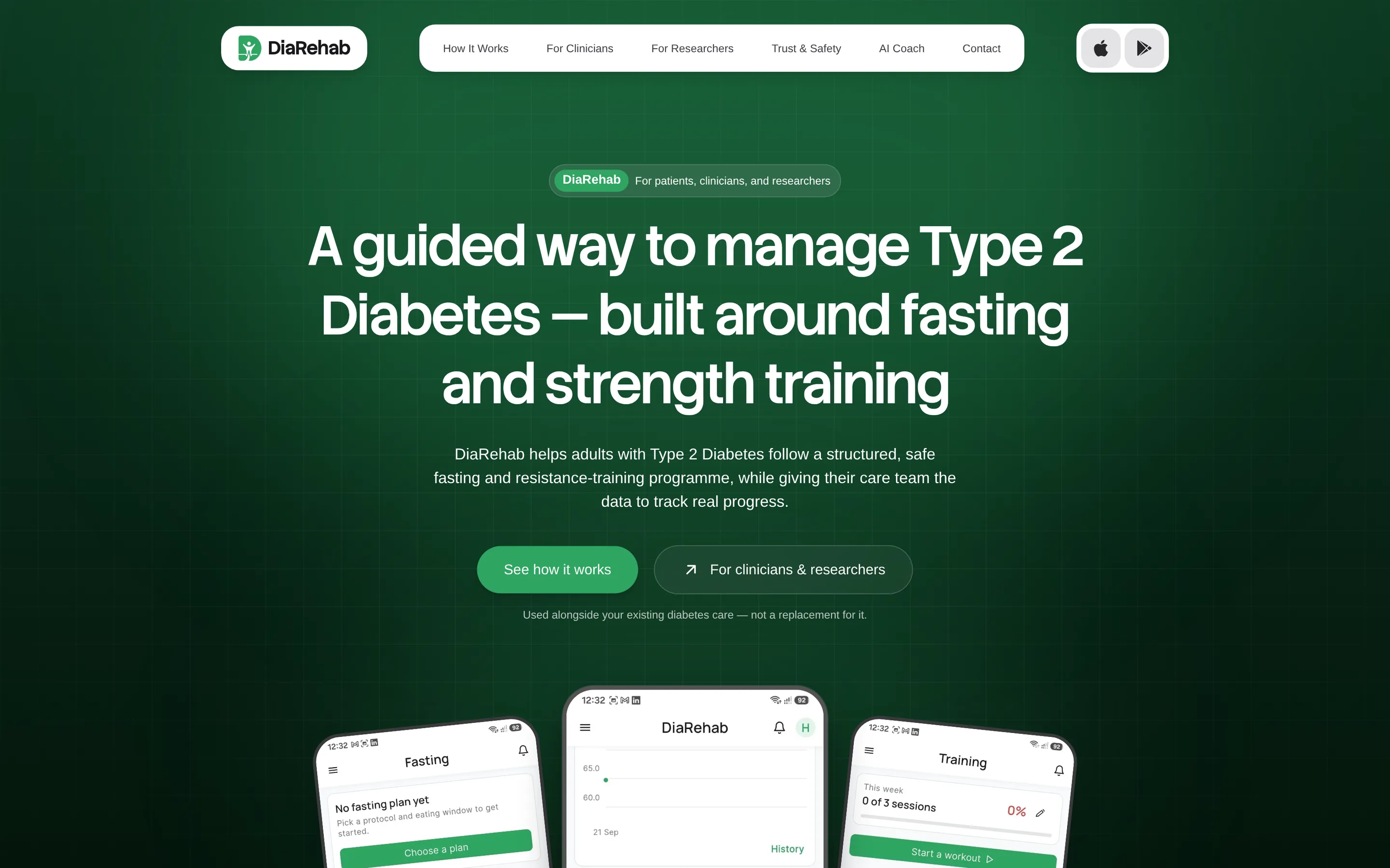
One calm page that tells patients, clinicians and researchers what DiaRehab is and where each of them goes next.
Overview
diarehab.online is the public website of DiaRehab, a diabetes rehabilitation programme for adults with type 2 diabetes. It is a single Next.js page styled with Tailwind CSS: a chapter for each audience, a menu that jumps between them, and a clear next step at the end of each.
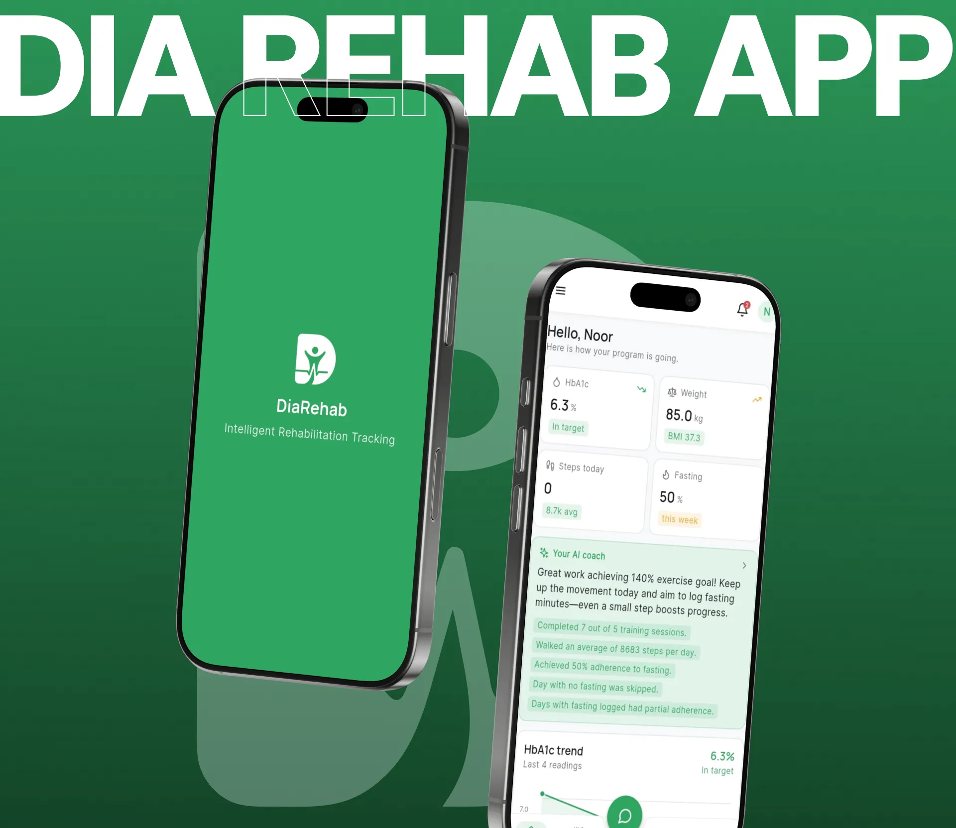
This case study covers the website only. The Flutter app, the clinician dashboard and the AI coach are a separate build with their own case study, DiaRehab app and admin dashboard, linked at the end of this page.
Project
- Industry /
- Healthcare & Wellness
- Category /
- Diabetes management website
- Platform /
- One-page website (Next.js, Tailwind CSS)
- Location /
- Global / Remote
- Year /
- 2026
The Story
Goal
Give DiaRehab one clear page that explains the programme to patients, clinicians and researchers, and sends each of them to the right next step.
Problem
The platform does a lot: fasting plans, strength training, outcome tracking, a clinician dashboard and research exports. Three audiences read for different reasons, and a long feature list would lose all of them.
Solution
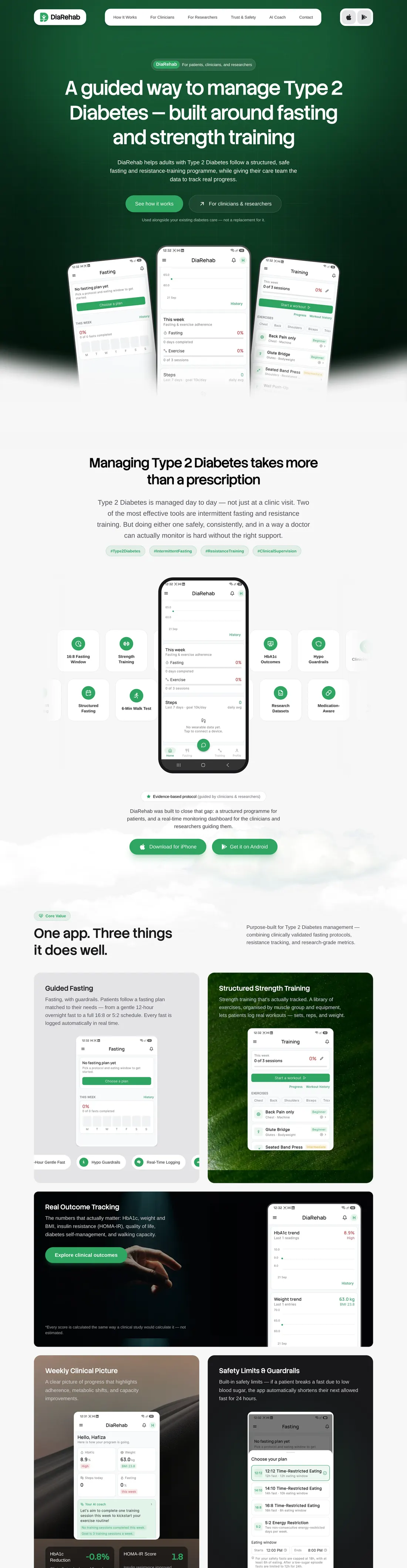
A calm one-page site that opens with two routes, walks patients through how it works, gives clinicians and researchers their own sections, states safety and privacy plainly, and closes with a way to get in touch.
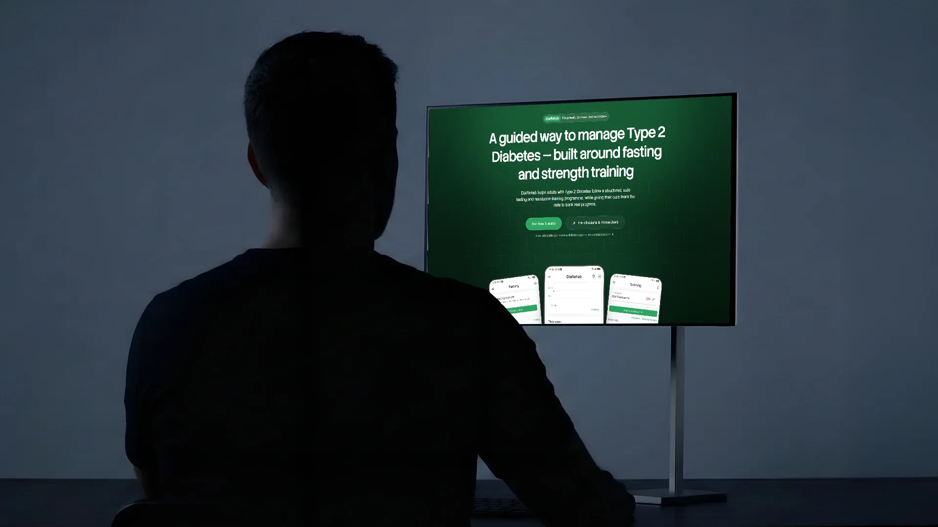
Website Design
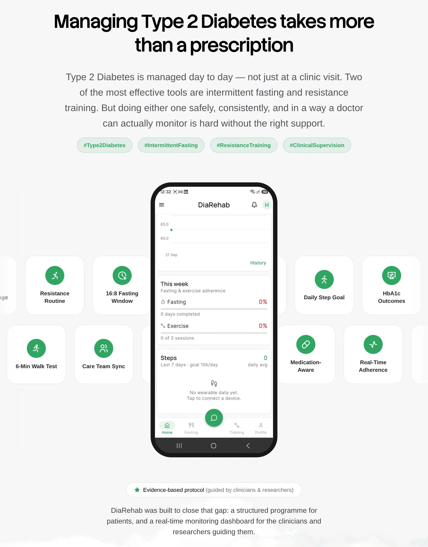
One page, read top to bottom. Each section answers the question one audience arrives with, using the same green, the same type and real app screens.
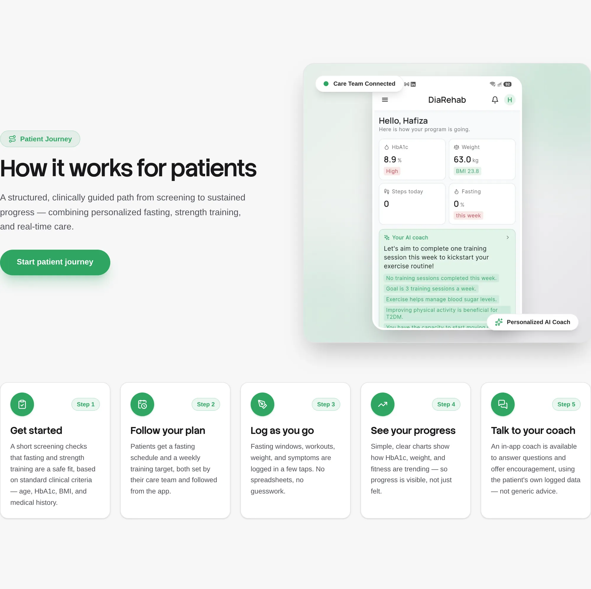
How it works, in five steps
Patients get the programme as a short journey: get started, follow your plan, log as you go, see your progress, talk to your coach. Each step is one card with one plain sentence.
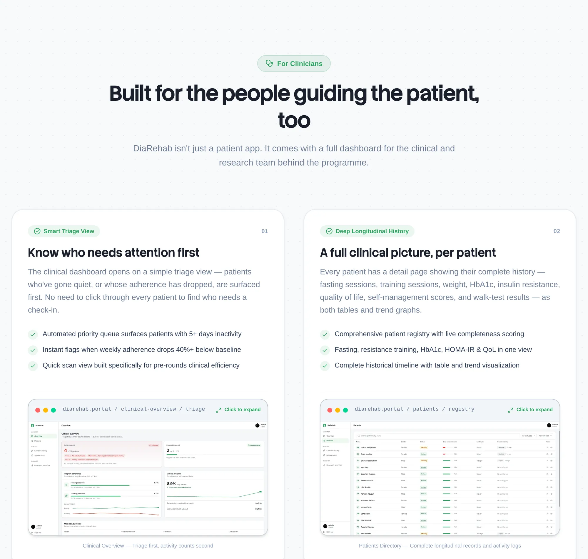
Clinicians and researchers get their own sections
The care team sees what the dashboard does for them: triage first, a full picture per patient, eligibility screening and medication awareness, each card paired with a real dashboard screen. Researchers get cohort reporting and exports in tabs.
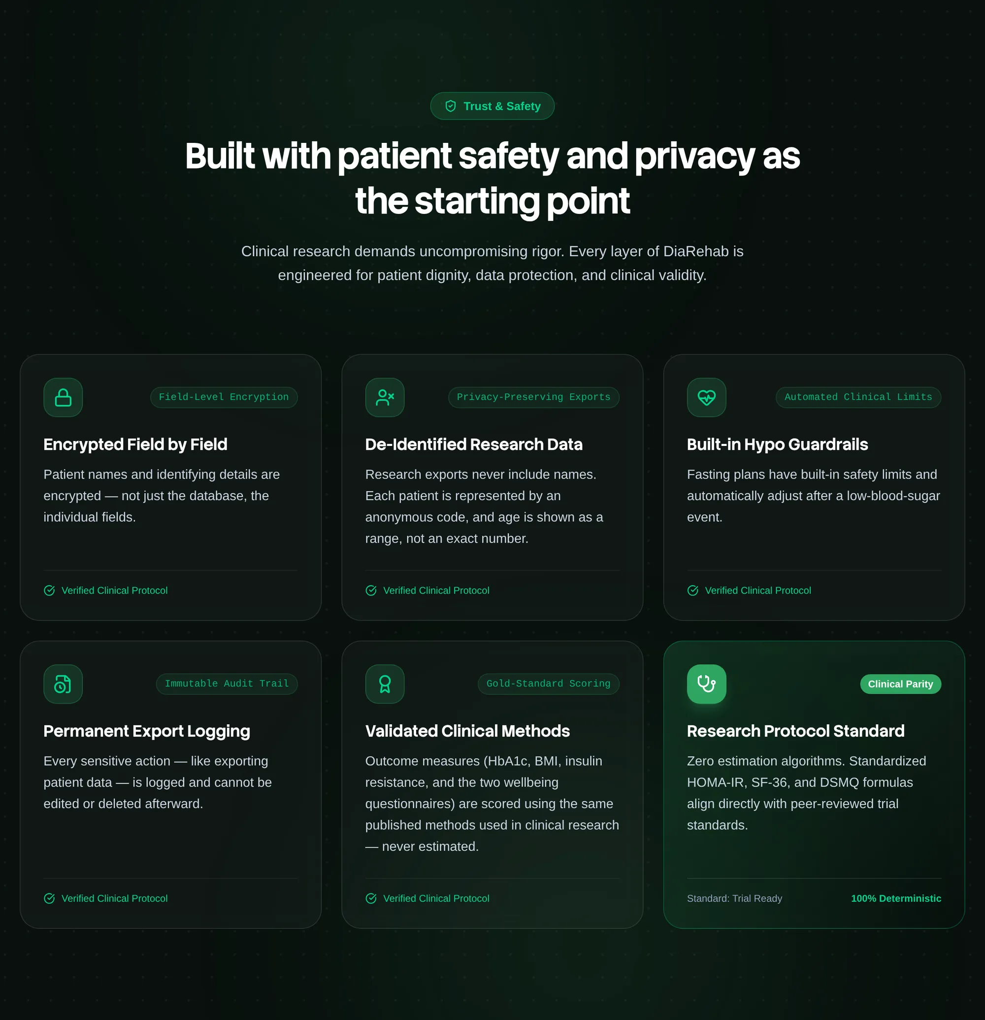
Trust and safety, stated plainly
A dark band slows the page down for the part people check most carefully: field-level encryption, de-identified research exports, export logging and fasting safety limits, one short card each.
Full Page View
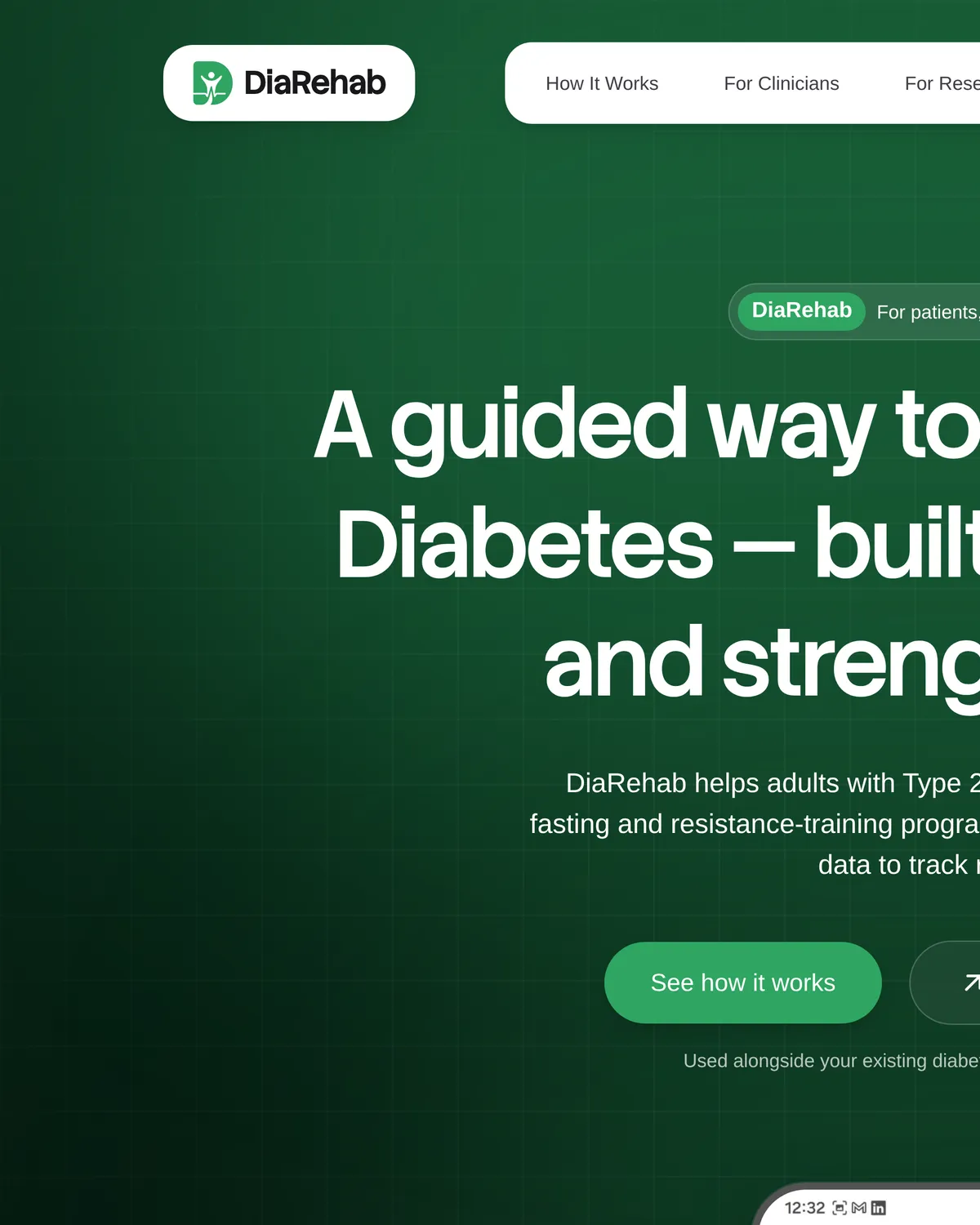
diarehab.online is one long page. The menu’s How It Works, For Clinicians, For Researchers, Trust & Safety, AI Coach and Contact links jump to its chapters. Here it is from top to bottom, in two halves, captured from the live site.


Design System
The website runs on its own small Tailwind v4 theme: two typefaces, one green with a darker hover shade, a forest gradient for the hero and zinc greys for text. The app’s token system and live theming are covered in the DiaRehab app case study.
A guided way to manage Type 2 Diabetes, built around fasting and strength training. Every chapter of the page opens with a short Stack Sans headline, so a visitor can scan the whole story in a few seconds.
DiaRehab helps adults with Type 2 Diabetes follow a structured, safe fasting and resistance-training programme, while giving their care team the data to track real progress. Body copy, buttons and labels are set in Google Sans Flex at medium weight.
Primary
White
#FFFFFF
Cards, the menu pill and the text on green buttons
Secondary
Green
#2FA562
Buttons, badges, icons and the glow in the hero
Set once as --color-primary in the site’s Tailwind theme, so every button, badge and icon on the page uses the same #2FA562.
Supporting tokens
- Hero gradient#0E3B23 → #061E12 → #020905
Contrast was measured, not assumed. #2FA562 is 3.14:1 on white, so the site uses it for fills, icons and large headings, and white button labels deepen to #25874F on hover (4.51:1, AA). On the dark forest hero the same green reads at 5.56:1.
FAQ
One-page websites for health products
What teams ask us before a landing page for an app, a clinic or a health programme.
Ask us anythingFor a launch, usually yes. One page can say who the product is for, how it works, how data is protected and where to get the app, with a menu that jumps to each chapter, the way diarehab.online does. Pages for pricing, the privacy policy or a blog can be added later without a redesign.
Next.js renders the page as real HTML ahead of time, so it loads fast from a CDN and search engines read every word. We size images for each screen, serve modern formats, load video and heavy sections lazily and check Core Web Vitals before launch. It is also the same React stack as most product dashboards, so site and product can share components.
It can rank for a focused set of searches. That takes a clear title and description, one H1, a heading for every chapter, descriptive alt text, structured data and a fast page. For a wider set of topics we add separate pages or articles, so each search lands on an answer.
Two ways. Content can live in the code and we make changes under a maintenance plan, or we connect a headless CMS so your team edits text, images and FAQs itself. Which one fits depends on how often the page changes; we advise on it during the first call.
Yes. Store badges and links into the app, an entry point for clinicians or partners, a contact or demo form that reaches the right people, and shared colour and type tokens so the site and the app look like one product. For DiaRehab we built the website, the app and the admin dashboard together.
It depends on the content, design work and integrations, so we quote after a short call. We ask what the page has to do, who it speaks to and what already exists (brand, copy, screens), then send a scope with a timeline.


Need a website for your health product?
Let’s do a project together!
A clear one-page site that speaks to patients and clinicians and leads to your app: we design and build it in Next.js, the way we built diarehab.online.